Compound Components with React Context API
Feb 23, 2019
React is a powerful UI library for developing web and native (React Native) applications. At its core, React utilizes a component-based architecture where every element is constructed as a modular component. For a thorough understanding of this concept, please refer to the official Thinking in React documentation.
In this article, we will explore an advanced concept known as Compound Components and demonstrate their implementation using React (v. 16.3) Context API.
Compound Component
Compound components represent a pattern where multiple components work together cohesively, enabling implicit state sharing between them.
A classic example of this pattern can be found in HTML’s <select> and <option> elements. While these elements have limited functionality when used independently, they create a powerful interaction model when combined through shared state management.
There are two primary approaches to implementing Compound Components in React: utilizing React.cloneElement or implementing the Context API.
The React.cloneElement approach is comprehensively demonstrated by Ryan Florence in the following video:
In this tutorial, we will focus on implementing the same functionality using React Context API.
React Context API
According to the official React documentation, Context is defined as:
Context provides a way to pass data through the component tree without having to pass props down manually at every level.
For those unfamiliar with Context, the following instructional video by Wes Bos provides an excellent introduction:
Final Output will look like this
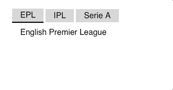 Compound Tab Component
Setting up the Context
To implement our compound component, we must first establish the Context using React Context API:
import React from "react";

const TabsContext = React.createContext({
    selectedTabIndex: 0,
    selectTab: () => {},
    headers: [],
    selectedDetails: ''
});

export default TabsContext;
Setting Provider
With the Context established, we implement the Provider component, which serves as the parent container and distributes context values to all child components:
import React from "react";

import TabsContext from "./TabContext";

const tabsData = [
    {name: "EPL",description: "English Premier League"},
    {name: "IPL",description: "Indian Premier League"},
    {name: "Serie A",description: "Italian Football League"}
];

export default class Tabs *extends* React.Component {
    state = {
    selectedTabIndex: 0
    };

    selectTab = selectedTabIndex => {
    this.setState({selectedTabIndex});
    };

    render() {
    const { selectTab, state: { selectedTabIndex }} = this;

    return (
        <TabsContext.Provider value={{
        selectedTabIndex,
        selectTab,
        headers: tabsData.map(({ name }) => ({ name })),
        selectedDetails: tabsData[selectedTabIndex].description
        }}>
        {this.props.children}
    </TabsContext.Provider>
    );
    }
}
Consuming Context Values
With both Context and Provider configured, we can now consume these values within child components, establishing state sharing between Provider and Consumers:
import React from "react";

import TabsContext from "./TabContext";
import Tab from "./Tab";

const TabHeader = () => {

return (
    <div className="tabheader">
    <TabsContext.Consumer>
    {({ headers, selectedTabIndex, selectTab }) => {
        return headers.map(({ name }, index) => (
        <Tab
            name={name}
            key={index}
            selected={selectedTabIndex === index}
            handleClick={() => {
            selectTab(index);
            }}/>
        ));
        }}
        </TabsContext.Consumer>
    </div>);
};

export default TabHeader;
Here, we distribute the headers, selectedTabIndex, and selectTab function from the Provider.
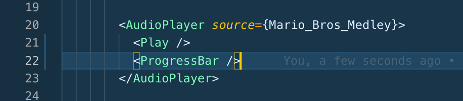
Following the same pattern, we implement the TabDetail component to utilize the selectedDetail value.
Now we can implement our compound component with full functionality:
<Tabs>
    <TabHeader/>
    <TabDetail/>
</Tabs>
This implementation produces the following result:
The component structure is flexible, allowing for various arrangements. For instance, to render the Details component above the Header:
<Tabs>
    <TabDetail/>
    <TabHeader/>
</Tabs>
Output
Audio Player
To further demonstrate the versatility of Compound Components, I’ve developed an Audio Player implementation, similar to the concept presented in the second video referenced above. The final implementation appears as follows:
 Audio Player Final Example
The Audio Player’s state is shared among all child components, enabling various implementation configurations:
Full Control

 Audio Player with Full Controls
Play Control
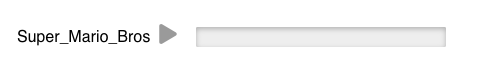
 Audio Player with Only Play Control and Progress
Play and Pause Control
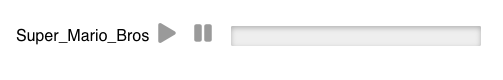
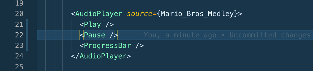 Audio Player with Only Play and Pause Control
Play/Pause Control

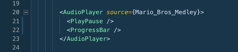 Audio Player with Play/Pause Control
The complete source code for both examples is available here.
Conclusion
Compound components effectively eliminate the need for conditional and repetitive code. For instance, in our example, rearranging the order of TabDetails and TabHeader components doesn’t require additional conditional logic within the Tabs component.
Important Note: Exercise caution when using Context API for compound components within loops (map operations). List items, in particular, should not be implemented as compound components using Context API, as this creates individual providers at each item level, potentially impacting performance.